 (This post is third in a series on writing an icon in the Orthodox Christian tradition. To start at the beginning, click here.)
If I were more advanced, I would be putting my own drawing on the board. I would work on a classical model, thinking hard about issues of geometry, style, and symbolism as well as drawing a human figure skillfully.
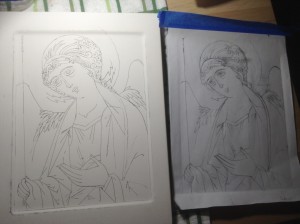
But I’m a rank beginner. Thankfully the teachers of the workshop I took provided us with line drawings for our first two icons: Archangels Michael and Gabriel.
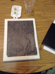
I start out with a photocopy and a sheet of carbon paper.
At the workshop we did Michael, whom you’ll see in Orthodox Churches on the door at the far left side of the iconostasis, the wall-like structure with its row of saints in front of the altar. At the far right door of the same wall you’ll find Gabriel.
Gabriel and Michael are basically mirror images of each other, with some differences in the colors of their clothes. They both are slightly turned toward the center of the wall, where you see Jesus.
Types vs. Portraits
All the saints on the wall turn toward Jesus, actually. They gesture toward him, framing him, the source of salvation.
Their lives reflected Jesus. That’s what made them saints.
Even if I had done my own drawing for the icon I’m writing now, it would look similar to other icons of the Archangel Gabriel. It would probably be recognizably my own, but the point is that it needs to be recognizably Gabriel. Each person rendered in an icon has their own set of recognizable features.
Those features, in turn, are displayed in a very specific traditional style.
- An icon is not supposed to portray the person like a photograph, or even as a classic painted portrait would.
- And an icon does not attempt to convey the personal emotions of the person portrayed.
- The icon is more conveying something like what older biblical interpreters would call the “type” of the saint.
In biblical interpretation “typology” is where one visible thing (the type) points to something else (the antitype) in a kind of divine revelation.
Most commonly Old Testament events are read as types hinting of the coming of Jesus in the flesh.
Yet death exercised dominion from Adam to Moses, even over those whose sins were not like the transgression of Adam, who is a type of the one who was to come. (Romans 5:14 NRSV)
Or earthly things can be types revealing the heavenly, as the earthly tabernacle or the temple were sketches or shadows of the throne room of God in heaven.
They offer worship in a sanctuary that is a sketch and shadow of the heavenly one; for Moses, when he was about to erect the tent, was warned, ‘See that you make everything according to the pattern that was shown you on the mountain.’ (Hebrews 8:5 NRSV)
Maybe it is easier to make the point with reference to something in icons other than people.
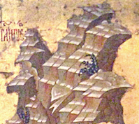 Take mountains. In every classical icon, the mountains look quite similar. And they don’t look like any mountains you will ever see on any earthly horizon.
They are “types” of mountains. They communicate the “idea” of mountains, or maybe the “mountain-ness” of mountains.
So… what you see on the board isn’t ultimately about the person of the saint. It points to the reality of a life that revealed Christ.
And it is those lines, the Christ-revealing lines, that need to be brought out and remembered.
Transferring the Lines
 In any case, I taped the drawing to the board along the top. Using a pencil or a stylus I followed each line, transferring the image to the surface of the board.
But before the first bit of paint could be added, something more had to be done: Each line had to be cut into the gesso surface with the sharpened steel point of a stylus.
Left unengraved, the lines would be lost as I applied the six or more layers of paint. The figure would drift and lose its proper shape.
But with the lines engraved with a stylus, I’ll always be able to find them.
Because of the engraving, the image will always be there, no matter how I mess up in my painting.
The Lines of the Image
My teacher drew our attention to the symbolism here:
We are created in the image of God. The lines are always there, no matter how much we mess it up.
There is an iconographic quality to every human you encounter. Life adds layer upon layer to this original image. You and I both know how thoroughly that image can be obscured in us. Some theologians have even argued that it is completely destroyed.
But the lines are still there. Like an icon in the hand of an unskilled artist, the intended design may be obscured and hidden. We may look a mess. But no matter how messy, the lines of the image are there. And God is the skilled artist who can restore us.
… seeing that you have stripped off the old self with its practices and have clothed yourselves with the new self, which is being renewed in knowledge according to the image of its creator. (Colossians 3:9-10 NRSV)
Writing an icon is about becoming aware of the process of my own redemption, an act of creation that teaches how the Creator works to restore me.
(The next post in the series can be found by clicking here.)
————
Lent is coming! What a great time to focus on your prayer life.
Click the button to get info on my online prayer class for Lent…

Leave a Reply